John Barnett and Marnie Galloway
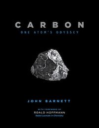
John Barnett’s recently published Carbon: One Atom’s Odyssey (May 2021) explores the incredible journey of a carbon atom from the beginning of the universe through smoke and animals on earth. In the introduction of the work, he explains that he was impacted by reading Primo Levi’s The Periodic Table, especially the last story called “Carbon.” Primo Levi was the first science communicator he came across. Marnie Galloway has worked for several kids magazines, including Muse and Cicada, illustrating a variety of science concepts. As a result of her work with Muse and Cicada, she’s now an illustrator with Ellen Braaf at “Ask Ask,” a science column in the kid’s magazine Ask.
How They Got Started
I asked both of them how they decided to do science illustration. After reading The Periodic Table, Barnett knew that he someday had to do something based on the story. But he wasn’t sure how to make the project happen. But when he had kids, he found that they asked a lot of “fundamental questions.” For instance, why do wood and metal feel different on the park bench when exposed to direct sunlight? Plus, he was unimpressed with their science classes. While he is not a formally trained scientist, he taught himself through books and began working on the book. He also got great feedback from friends and acquaintances who were scientists. Galloway explained that she had started at Muse, a middle grade science magazine, and Cicada, a YA literary magazine that’s no longer in print. When the serial artist for “Ask Ask” stepped down, she was one of three or four artists asked to pitch. She designed new characters (a chipmunk and a pigeon), and submitted a sample comic. “My pitch was selected, and I’ve been making the comic monthly ever since!” she says.
Making the Abstract Comprehensible
One of the biggest jobs for science illustrators is making the concepts understandable for multiple audience. While Barnett doesn’t think of Carbon as a children’s book, he wanted to communicate the concepts to the audience. He said,“One thing I did not want to do is draw too much microscopic stuff. I wanted to keep it pretty tangible like there’s a rock, water, or a falcon.” He didn’t want it to get too abstract. Galloway’s biggest challenge is hooking the young readers. She works “to tempt them with at least one big fun panel that will pique their curiosity and keep them reading the whole comic.” She has her 5-year-old son as a first reader “who looks over my shoulder when I’m working and lets me know if the comic is funny enough, if a visual joke needs to be workshopped. Ask is such a great magazine, I always want to make sure my comic is up to snuff.”
Figuring Out What to Illustrate
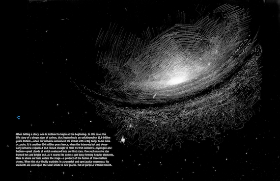
For all illustrators and artists, they have to make a decision on what to illustrate in their work and what to leave out. When asked about how Galloway decides what to illustrate, she explains that it’s dependent on having a great relationship with the writer, Ellen Braaf. Galloways says that Braaf and the editors discuss what information is best communicated visually, and what information is better presented through clear and direct explanation. However, she’s got room to maneuver. “Occasionally when I am laying out the comic I realize I have more space than usual to indulge in extra visual explanation, or that the text takes over too many square inches and I have to abandon a great suggestion for a visual explanation,” she said. “This is such a well oiled machine, I very rarely have to make suggestions for changes to strengthen the comic beyond the script I am provided.” As for how he decided what to show in Carbon, Barnett said, “Primo Levi laid out a map. I wanted to follow that part pretty closely. Some are obvious, [like the] peregrine falcon.” Barnett wanted full page illustrations with no copy at all. At one point in the book, the carbon has “turned back into a part of carbon dioxide, and it’s just cruising around the planet…At this point, I don’t have to stick to some linear narrative. I’m gonna use three spreads in two different places where it’s like the carbon is an eyewitness to some portion of the planet.” He wanted to show beautiful things about the natural world, from polar ice to deserts. But he also said he wanted to show some of man’s meddling in it in some way. Each image is accompanied by a chemical equation, which helps to reinforce the image with the science behind it. Barnett explains, “The chemical equations are there to remind you there’s still this microscopic thing and structure going on. And there’s that C, again, that same C.”
What They Have Learned From the Work
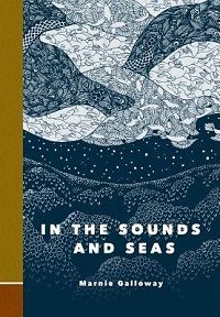
Galloway is not just a science illustrator; she’s an award-winning cartoonist with In the Sounds and Seas and other works. I asked how her work with science concepts has influenced her other work. She says she has always been “an armchair science enthusiast,” she often draws her science and nature interests “as a springboard for metaphor and meaningful emotional connections.” For example, she says, “when my firstborn was a few months old and I was up all night with him, I saw an article linked on Twitter that scientists had recently discovered that trees sleep. That was both fascinating and deeply infuriating, reading that trees were sleeping more than I was! That knee jerk emotional reaction was the foundation for my comic Burrow.” Ultimately, she has found that her “creative process often begins with research on something very far away from my life and expertise to get out of my head, and often that research question jumps off of my curiosity about the natural world.” Barnett wanted to show the relationships in our world. For instance, he says, “A grape leaf when you get pretty close has a real texture to it. Some of these things start to look not the same, but there’s patterns that happen. When you shift the scale or squint your eyes, you might be like, ‘Oh, that smoke looks kind of like water or that patterns on the city streets almost look like that grape leaf’.” Barnett also explained that he has a degenerative eye disease and is slowly losing his eyesight. That was part of the recent motivation to make Carbon. But as a result, he says, “I really have slowed down and look more carefully at stuff. And so I think that it’s helped me. I do see things like [the pattern in] the end sheets of the book. That’s decaying logs that I walked by least once a week. I find patterns and beauty in that; I’ve seen this tree rotting away for a few years now…It’s a lot about looking carefully, which I do more of now. And I think there’s legitimately an element of it for me, trying to memorize this stuff a little bit visually, because I do think maybe I won’t always be able to see it. But if I look at it this closely, and I draw it for two weeks, these crazy patterns, I’ll never forget it.” This book will certainly help the reader see these incredible patterns, big and small, in daily life.
A Little Extra
When I asked Galloway about her favorite thing she has illustrated, she said, “my favorite comic was answering the question, ‘why do animals have tails?’ Getting to draw a hippo with its tail spinning in circles to territorially distribute its poop was a career highlight! My kids have never been more proud.” That’s just a taste of how two designers approach science illustration and why it’s such a fun and important part of comics and design. Want more science illustration? Check out this Rioter’s list of 11 Nonfiction Science Comics for Adults. See this discussion of Picture Books to Teach Science.


